
A detailed look at the experience design process of Frank Digital’s CanTeen Connect, a platform that connects young people and parents affected by cancer.
The beginning of a wonderful partnership
Cancer charity CanTeen’s sole purpose for existence is to make sure that young Australians don’t have to face cancer alone. So, Frank Digital has thought that was a pretty good proposition and since 2017 they’ve partnered with them on a number of digital touch-points within their ecosystem, meticulously seeing them into fruition over a long-term roadmap.
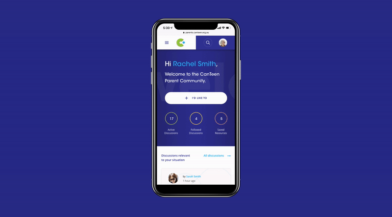
The partnership began with an initial high-level review of the CanTeen digital ecosystem, from which their first project brief was revealed: to take the existing online community platform for young people and re-platform it for their parents.
The long-term goal was to scale on the new platform and deliver a brand new experience for young people.
Discovering parents
Frank started their project by better understanding the parents they were building the platform for.
Frank’s cross-functional team of strategists, product managers, experience designers and technologists interfaced into Canteen’s product, marketing and tech departments to get their initial insight into their parent user, as well as any high-level business considerations.
Other than a few anecdotal take-aways, it was clear they needed to more deeply understand their parent audience. Taking a user-centric approach, the agency started with a thorough research and discovery stage.
Focus groups
A series of focus groups made up of parents affected by cancer were undertaken. In these groups, parents were asked what services they felt would be beneficial if they had access to them.
They analysed a large amount of raw data; requested services, functionality and journey behaviours to identify patterns, value propositions and user journeys. From this process came one clear, actionable insight — the need for parents affected by cancer to easily connect with others in the same situation as theirs.
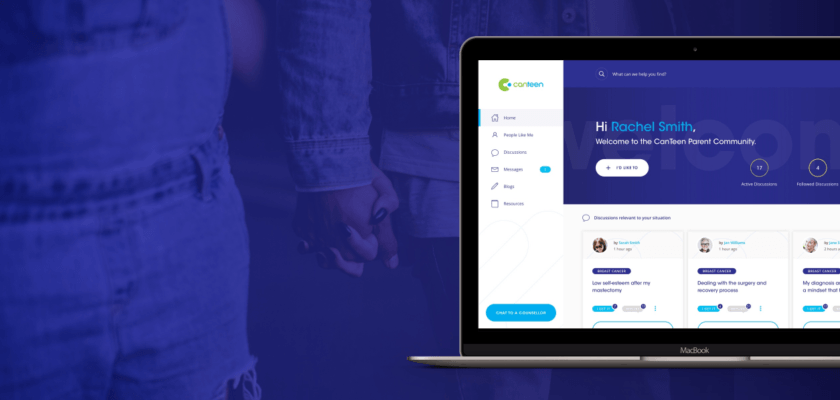
Thir overarching platform goal became: connection. And ‘CanTeen Connect’ was born.
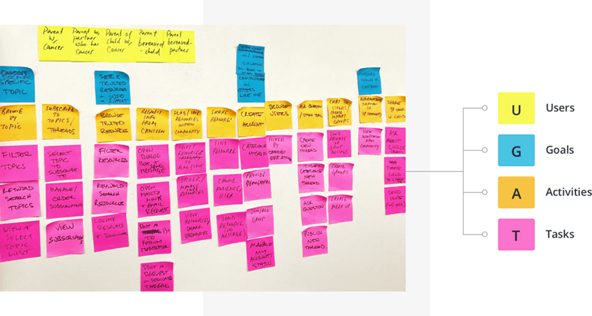
User-mapping session 1: Core users and features
From this platform goal they moved into a series of user-mapping sessions with CanTeen.
In the first session Frank aligned on users, agreeing that their primary end-users were parents, but a number of internal users were to be considered; content creators, moderators and internal staff — grouped as ‘platform administrators’.
Shifting the focus to the end-users, the agency identified the key goals parents wanted to achieve on the platform. Each goal is defined by a set of activities to achieve the goal, which in-turn are defined by a set of tasks required to complete each activity.
So for example:
Goal: ‘Communicate with others like me’
Activity: ‘Find other users to communicate with’
Tasks: ‘Filter users’, ‘Message users’
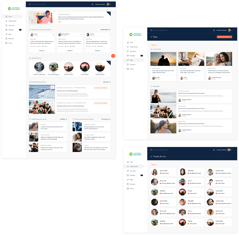
This process helps to define the agency’s core platform features that will achieve connection. CanTeen Connect’s core features include:
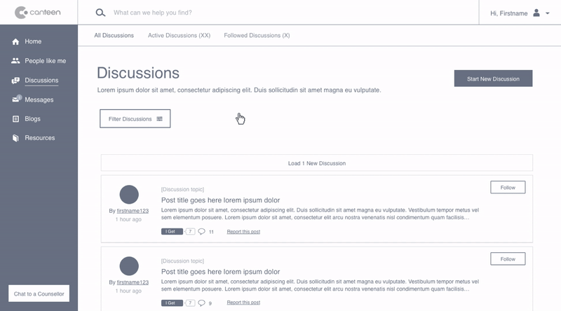
• Online discussion boards where all the topics and content related to that particular user’s situation;
• Smart filtering that allowed for easily finding other people going through the same cancer situation;
• Easily connect and communicate through direct messaging;
• Allow parents to share experiences and encourage others through writing blogs; and,
• Access to professional resources that helped parents through their cancer situation.
By the end of the first session identified their users and had a great understanding of their core platform features for parents to achieve connection. But they had exhausted their time and still needed to map the ‘platform administrators’. You can’t forget your admin users!
User-mapping session 2: Platform administrators
In a follow-up session for platform administrators who undertook the same user-mapping process, identifying 3 core goals:
• Provide a healthy and safe environment to support users; and,
• Better understand user activity
• Centralise blog and resources content creation
As a result, the core features to achieve these goals included:
• Moderate discussion boards;
• Manage platform users;
• Create platform-wide announcements;
• Download user activity reports; and,
• A single content repository to manage blog and resource content.
As they worked through the needs of platform administrators CanTeen also identified a new internal user; online counsellors.
Online counsellors were identified as a critical long-term priority for the platform as it would transform the way CanTeen provides their support services. Not only would they be able to support more people with fewer resources, but more critically, they would be able to connect valuable support to those in remote and rural areas.
While CanTeen still had work to do to make their online counselling service a reality, it was important Frank considered how they could ensure counsellors could easily & effectively counsel people online during their design stage.
Design
Equipped with their discovery data and user-focused requirements they commenced the design stage of the project.
Initial ideation and prototyping
Starting with the user-facing part of the platform they sketched out what each key feature could look like.
From there rapidly visualised each platform section as clickable prototypes. This enabled the Frank and CanTeen teams to test and measure how each area functioned and how users responded to the overall product.
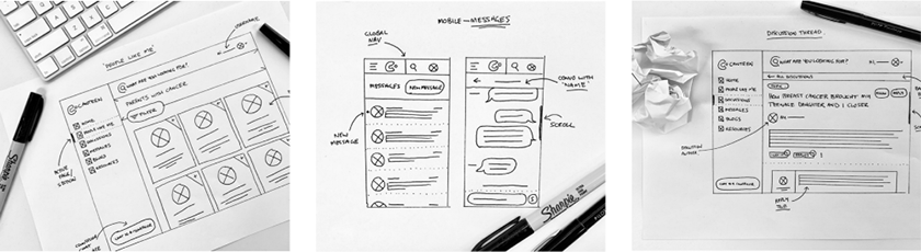
The clickable prototypes were tested and validated with the same parent groups from the discovery stage. As gathered feedback, who iterated their prototypes based on any patterns and trends — an invaluable process that continued to strengthen the platform usability.
The greatest satisfaction was found in hearing from parents ‘How excited they were that they were creating a community for them to support each other’ and that ‘They couldn’t wait to start using it’. Nice when they get to create something that truly transforms lives!
Categories/taxonomies
In parallel to creating these prototypes, Frank Digital have worked with CanTeen to categorise the content across the platform — a process of ‘creating taxonomies’.
It is a critical strategic piece that underpins the content of the entire platform, and influences how to leverage content through the features they design.
Knowing that parents wanted to connect with others like them, they defined a series of parent ‘situations’ which users could easily identify with when they registered for the platform. This then set-up the creation of their ‘smart filter’ which would tailor content to each user, and more easily connect them with others in the same cancer situation.
Interface design
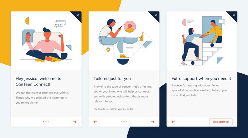
Once their prototypes and taxonomies were approved, they moved on to crafting a robust and scalable interface. While working with the CanTeen visual style guide, Frank Digital focused on crafting elements that felt familiar and would help users naturally ‘know’ how to use the platform.
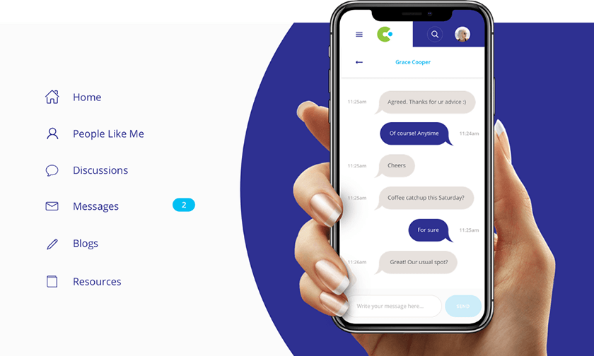
An example of this is their design approach to Messages — the piece-de-resistance for achieving connection on CanTeen Connect.
Millions of users engage with direct messaging everyday. Apple Messages. Whatsapp. Facebook Messenger. All these platforms have common design patterns that make it easy for new users to use.
Frank audited these design patterns and leveraged similar approaches to develop a sense of familiarity, allowing users to more quickly ‘connect’ with others instead of ‘learning’ how to use the platform.
Through continuous validation with the parent user base they also made enhancements to the management of group messages, and continuously iterated on the messages system to design a robust and highly functional experience for users to manage their direct and group messages easily.
Frank Digital extended this approach to craft a series of design patterns that made the platform feel new and instantly familiar all at the same time.
Once their design patterns were approved, they then dug into the detail; meticulously designing a beautiful and elegant interface that brought the CanTeen brand to life across the platform.
Rapid iteration and prototyping
After completing their responsive interface design they looped back and began rapid prototyping the back-end CanTeen Administrator area.
From their workshop insights and user requirements, they needed an easy way for platform administrators to moderate discussions, manage platform users and generate reports.
They rapidly prototyped a backend dashboard and admin area which was validated with the CanTeen administrators who would be using the platform.
Chat with a Counsellor
The final aspect of the design phase was to design the means of ensuring counsellors could easily and effectively counsel people online. Naturally, a chat service was identified as the appropriate solution.
Their design and tech teams worked together to find the best ‘out of the box’ solution so the agency could rapidly prototype the process with CanTeens internal teams, without investing too many resources up-front.
Finding Intercom’s simple, customisable and recognisable interface that sat seamlessly into their platform interface to be an immediate win.
Further, their powerful Artificial Intelligence (AI) bot system allowed CanTeen to set up a system of responses for when CanTeen staff were online and available, as well as manage intake through AI when CanTeen staff were unavailable.
Iterating and scaling a new experience for young people
After the successful build and national launch of CanTeen Connect for Parents, the agency regrouped with CanTeen and planned their scaling of the new platform to roll-out CanTeen Connect for young people.
Mapping unique age-appropriate requirements
Due to the age and stage range of this younger audience (ages of 12–25) as well as CanTeen’s strict governance policies, conditional logic was required to manage how different users across different ages would engage with the platform.
CanTeen has a very clear and effective privacy system in place to protect young people so it was essential that the conditional logic respected the same privacy system.
For example, CanTeen opted to have the ‘Direct Messaging’ feature hidden for platform users aged between 12 and 16. They also wanted an optional age content filter for users over 16 when creating discussions to be able to flag it as ‘age-sensitive’ (hiding the content to users under 16).
Frank mapped these use cases and journeys across the various age groups to handle all the potential scenarios that would arise, such as:
- User under 12 trying to register for the platform
- Existing user who has just turned 16, and how to onboard them with using the new messaging features when they next log in to the platform
- User over 16 reads a published discussion and needs to flag it as ‘age-sensitive’
Introducing new platform-wide features
Having already shipped the parent platform, they had the opportunity to gather a series of feature requests from users which naturally rolled into the community for young people as progressed.
Platform-wide Notifications
As the platform user-base grew, the need for developing a global notification system was imperative. They need to alert users when they had a new message, when others replied to their posts or when CanTeen published announcements and new content.
Prototyped and designed a global notification panel, which could be accessed from anywhere on the platform.
The final step to complete this experience was a way for users to customise and manage their notifications. Introducing ‘notification preferences’ in the settings panel addressed this nicely and allowed users choose the method and frequency in which to be notified.
Blocked Users
A facility for users to block other platform users if they encountered issues (such as bullying etc.) was another area that came up in their mapping sessions with CanTeen.
Frank mapped out the use cases for end-users and platform administrators, addressing how each user would interact and then manage the outcome of blocking a user.
For example:
- User blocks another platform user
- User gets visual feedback that the user has been blocked
- User can access ‘manage blocked users’ in their settings to unblock users
- Platform administrators can see all blocked users and the reason why that user was blocked
Inactive Users
An important aspect of the platform was developing a sensitive way to handle various reasons why a previously active user may stop being active on the platform, one of which being they had passed away.
Frank workshopped messaging with CanTeen and crafted visuals for the profile panel which communicated to users. Reduced profile opacity subtly differentiates deactivated accounts from active accounts, while users are encouraged to contact CanTeen with any questions.
CanTeen Events
CanTeen run a number of events for young people, so surfacing and promoting these events formed a new requirement for this iteration. Along with providing the expected event-specific details, a business requirement was to get users to register their interest through the platform.
With all these new requirements and user considerations mapped out, they went through another round of rapid prototyping and testing to validate the CanTeen Connect iteration.
Crafting a visual aesthetic for young people
When it came to the visual identity the peer platform, Frank Digital were asked by CanTeen to push the current brand boundaries and explore a palette that would instantly resonate with the audience.
After exploring and iterating several creative territories, they have landed on ‘the one’:
This new visual direction for CanTeen, while originally targeted for a younger audience, ironically, gave the product a new sense of maturity.
Rolled out a few key screens of the platform with this aesthetic and then showed it to a focus group of peer users to gauge their response to it.
After validating the visual direction with the key young person audience, the agency rolled out the new UI Kit across the platform.
Final thoughts
Now after a little over 18 months of discovering, designing and coding, Frank Digital are proud to have built one of the largest, most complete and robust products they have ever created. Frank Digital are prouder to get to do it with one of the best, most forward thinking organisations they have ever worked with.
CanTeen and Frank Digital have created a platform that is truly ‘connecting’ people affected by cancer; both with each other and with the significant support services CanTeen provides. And together, that is something to be truly proud of.