

When it comes to logo design, designing for startups is perhaps the biggest challenge. Why? Because a startup’s identity often directly correlates to its success or failure.
Business owners want their brand to stand out, be recognizable, and for their logo to engage the personality and purpose of their new-born company. A logo is the first and the most durable ‘memory’ of a brand in the mind of its audience.
You can say that they’re just small images, but logos carry a whole lot of meaning–and designing one comes with a whole lot of responsibility, too. And this is particularly true for new companies, since they want to make an impact, create meaningful associations and turn audience into customers.
Did you know that 90% of startups fail? And guess what? I believe that large percentage of them fail because of poorly designed logo and brand identity. So I thought it would be interesting to provide you with what I know about logo design in hopes of educating you before you dismiss the importance of a well-designed logo.
I have been a logo designer for over 10 years, and the most important wisdom I’ve learned about logo design is this:
Logo needs to be simple, memorable, timeless, versatile and appropriate in order to work.
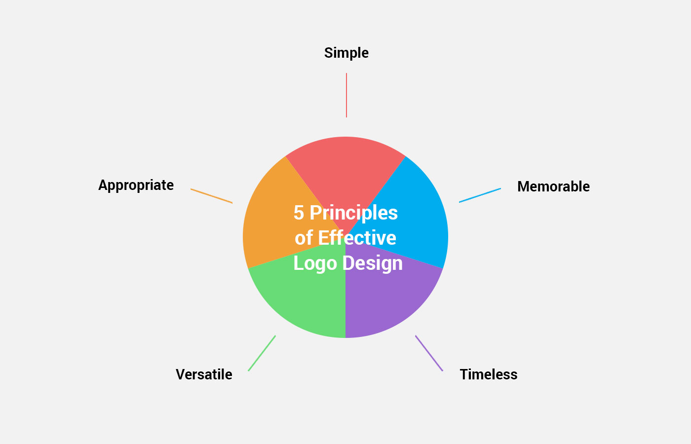
So I’ve judged hundreds of tech startups in terms of their logo aesthetics against these five principles of effective logo design and I came up with a list of 10 best tech startup logos:
1. Iterate
Iterate is a platform for getting the customer feedback (in the form of surveys) to empower teams to make better decision and build better products.
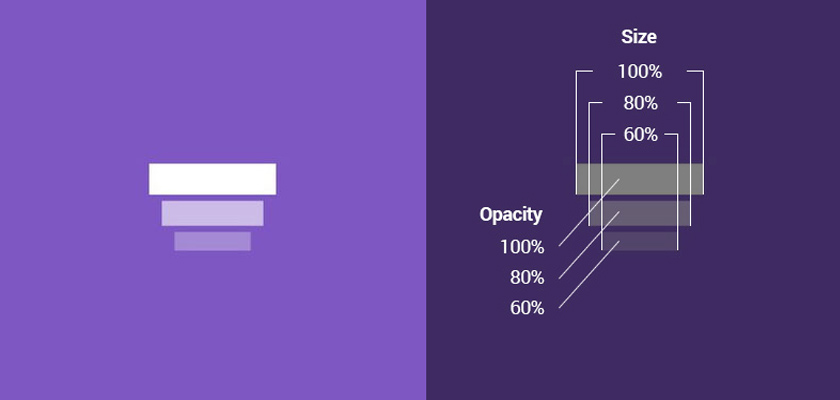
The logo illustrates the process of iteration in the simplest way. The three horizontal bars, stacked one on top of another, scaled up and fading give us impression of something that becomes better which each iteration.
Through this simple graphic treatment, the appropriate meaning was given to the most simple forms – rectangles. The simplicity of this logo allows it to be used in the smallest sizes without compromising on quality.
Therefore, the designer made it possible for the viewer to associate the company’s name with those bars in an instant.
2. Flash
The app lets you find exciting adventures near you in a minute or less, no plans, or dates required. On the flash you can also create events to celebrate, assemble, get down to business, and more.
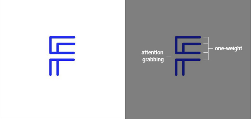
The logo uses one-weight line to build the first letter of the company’s name Flash. The logo is at the same time simplified version of a maze. There’s something interesting about how the second bar of the “F” letter is drown, which can be read as a route, a way to go (a propoer way) like in a maze.
And that’s all about the company which let’s you find a quick way to adventure near you. Moreover the saturated blue color resembles the standard link color, which can be further associated with connecting you quickly to those adventures in a “link click”.
3. BottleUp
BottleUp is a mobile nightlife reservation platform allowing customers to seamlessly book VIP tables and bottle service to exclusive nightclubs and lounges anywhere in the United States.
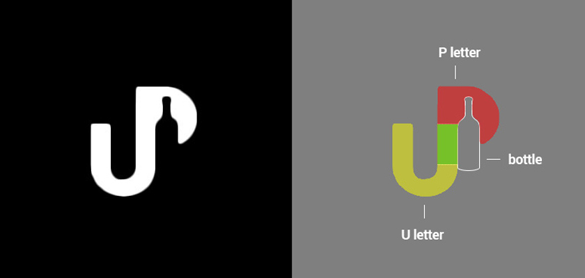
The logo cleverly uses negative space within P letter to create a bottle shape. In addition to that the UP abbreviation is the second part of the company’s name. The U and P are being smartly connected, with the P rising up.
What can be more appropriate than that? we have direct connection to the name “Up”, symbol of the bottle in the negative space, plus P rising up.
The logo itself doesn’t use any other color than black and white which gives it more upscale and chick look. After all it’s about expensive bottle service and VIP lounges.
4. ClassCode
Learning tech online is almost impossible. Less than 3% of people that start online courses finish them. ClassCode lets you learn tech from onsite classes taught by independent instructors nearby.
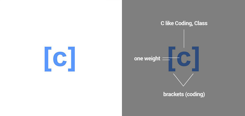
The logo uses simple brackets and the first letter of the startup’s name. Brackets are directly correlated to the coding itself, which totally makes sense. Other than that the logo is very simple, which allows for wide use across different media.
The blue color is commonly known for it’s secure, reliable, honest and sincere associations. Just think about the logos of banks and financial institutions – most of them use some shade of the blue color.
It’s simple, it’s memorable and it’s appropriate for the tech community!
5. Moozicore
Moozicore is revolutionary music streaming service that transforms background music in venues into an interactive customer-sourced playlists. Customers can control music in venues directly from their smartphones.
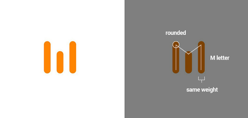
The logo uses three vertical bars with rounded edges that form M like Moozicore. The bars also symbolize sound waves which makes its appropriate for a company that operates in the music streaming space.
The sound-wave concept was executed in a way that makes us look at the logo a little bit longer than usual. Only after having a look at the mark and the company’s name we can decipher what it actually is.
More bars could be used to shape the M letter, but it would also make it more complex in shape and ultimately loose that attention grabbing, almost abstract simplicity.
Orange color (SoundCloud like) seems to be a good choice, giving the fact that it’s bright, and warm which adds some character to that minimalist logo.
6. Unveil
Unveil is a web app that helps couples manage and research their wedding vendors with ease. They’re pulling the veil back on the process of hiring wedding vendors.
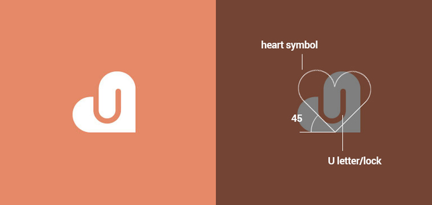
Heart symbols might be to omnipresent, but this logo seems to be different enough to stand out from the crowd. The hart is appropriate since we’re talking about wedding-related services.
The most interesting part of this logo is it’s 45 degree rotation, so it lays on the left side. This simple treatment differentiate this generic symbol among other heart-like logos. But wait, there’s more: in the negative space we can find a clip shape and the U like Unveil.
Very clever, very smart, and different enough to work among other heart-like symbols. The color is original too, is not simply red, but rather a unique color that adds some character to the overall look & feel.
7. Mirror That Look
Mirror That Look is an Image & video recognition API designed specifically for fashion merchandising, e-commerce, affiliate marketing, and digital advertising.
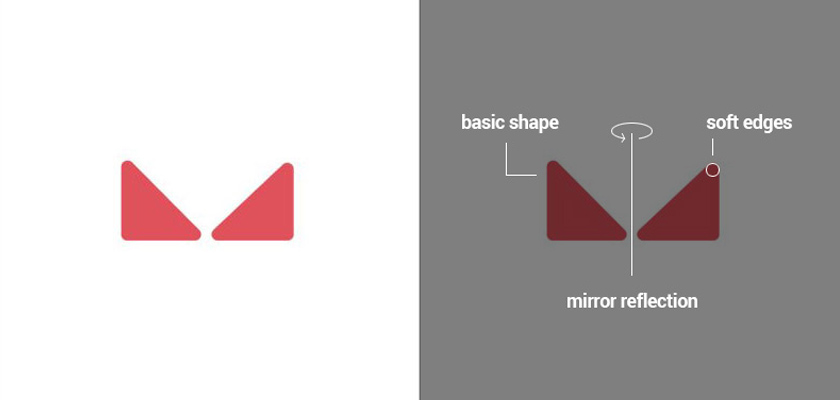
The logo uses basic shapes – two triangles set in mirror reflection which directly illustrates the company’s name in the simplest way. This simple graphic treatment sends an immediate message to the people who see it – Why these triangles are in mirror reflection? – Huh because the company “mirror that look” Gotcha!
The company is innovative, so there’s no point in using blunt colors. The bright redish color looks and works great, it speaks directly to the industry they represent – AI, Technology, and digital world.
8. Green Spork
Green Spork is a new type of meal planner that works to reduce leftover perishable ingredients by intelligently pairing recipes. The average American household of 4 will throw out between $1,350 to $2,275 of food annually.

Using the first letter of the company’s name might be a cliche, but if you make it distinctive enough it can be a super smart solution – just like this one. Have a look at this beautiful negative space inside the “g” letter forming a spork without disturbing the legibility of the letter itself and only slightly manipulating on it’s shape.
The green color seems like an obvious choice for a startup that has a “green” word in the name. Perhaps the logo design and naming were conduct simultanousely because of the symbolic link between green and nature.
9. TeamSync Bookmarks
TeamSync Bookmarks makes sharing bookmarks, online resources, and other tools easy by syncing bookmarks across computers in real-time. They use cloud-based technology to ensure that you have access to all bookmarks anytime and anywhere.
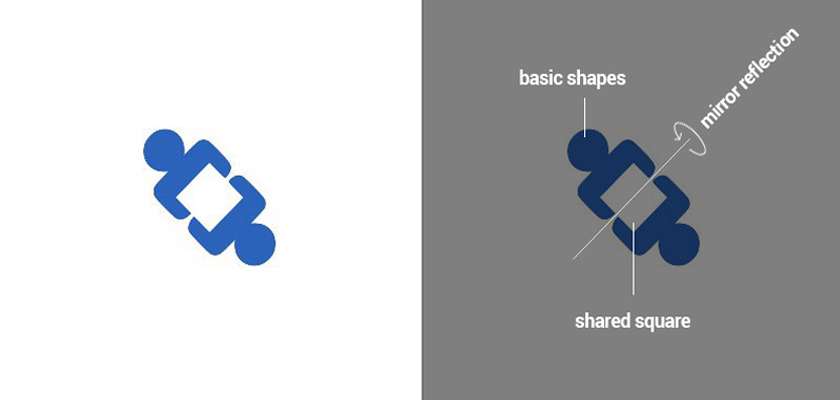
The shapes you use in your logo, as well as the logo’s overall shape, is important. This logo consist of top view of 2 people sharing something together that seems like a box. This was achieved through outstanding simplicity.
The is able to convey the idea of sharing and syncing by using only very basic shapes like circles and rectangles. More dynamism was added by rotating the logo 45 degrees which compliments the static square in the negative that draws our attention.
The usage of blue color is just.. safe. Blue is a color that conveys trust and reliability, which makes it a good choice for a cloud-based technology company.
After all, I don’t care how good the product or service you offer is, but if your logo sucks, if it’s not legible, if it doesn’t resonate with people, you’ll have a hard time building on that, any startup not only in tech space.
Think of it as the face of a new company’s body. And with more information available to the average consumer today, logos also have to quickly and effectively communicate on behalf of their brand.
A well-designed logo and brand identity system will increase your perceived value and enable you to reach your full potential market and improve your sales and ultimately set you up for success.