
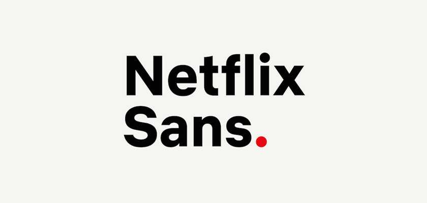
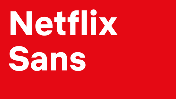
Netflix Sans is a new typeface developed by Netflix‘s in-house design team in partnership with foundry partner Dalton Maag, the company behind typefaces for AT&T, USA Today, and Intel.
In addition to bringing a unique brand identity to the company, the new custom typeface will also help Netflix, the streaming video giant, to reduce its existing impression-based licencing fees.
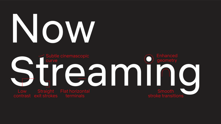
Aiming to serve display and functional purposes, the designers from Dalton Maag chose the characteristics of Netflix Sans cautiously.
Noah Nathan, one of the design leads of this work shared on his website:
The clean and neutral lines give without taking, favoring art over distraction, and eliminating excess. The arched cut on the lowercase “t” is discreetly inspired by the cinemascopic curve that is so iconic to the brand’s wordmark and symbol.
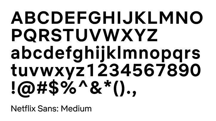
As it is mentioned, the new font has six different styles: Netflix Sans Regular, Netflix Sans Black, Netflix Sans Bold, Netflix Sans Medium, Netflix Sans Light, and Netflix Sans Thin and it will be rolled out on the online platform in the near future.
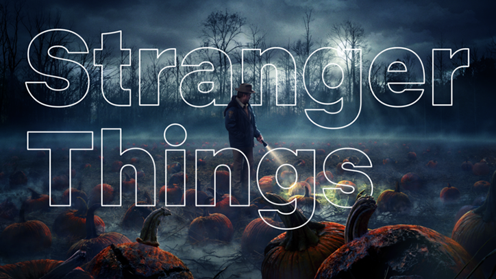
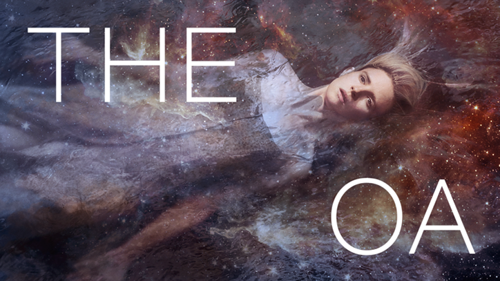
Below are some samples of Netflix Sans shared by Nathan:
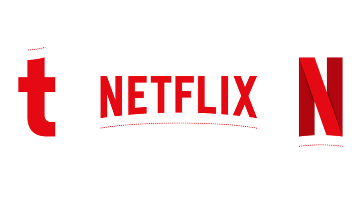
Netflix took a creative step of developing a new typeface to distinguish the brand; as some technology giants such as Apple, Samsung and Google have already did. However, the new change has also been criticized with its similarity to commonly used font Helvetica and designers from the industry have discussed if it could be more original, so far.
It’s quite controversial if the company will make any change in the new design but switching from Gotham seems good news for Netflix fans, since we all expect company to spend its money on bringing more unique content.