
Cloud-based team collaboration tool, Slack have revamped their most loved logo.
The identity updates Slack’s familiar hashtag logo to work consistently in different scales and contexts. The beyond-successful work collaboration platform, has launched a new, buttoned-up brand in anticipation of its 2019 IPO. The new work, led by Pentagram, kills off the company’s longstanding hashtag logo. The playful plaid is gone, too.
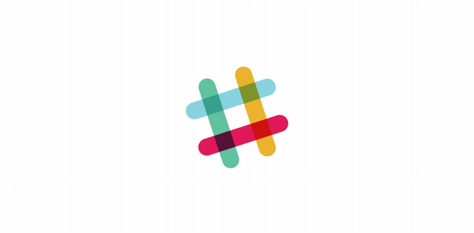
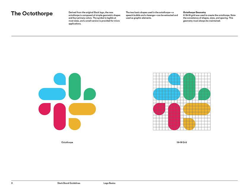
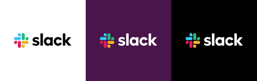
The new branding includes several big changes. The wordmark has been given sharp edges instead of its old curves, but still set in lower case, promising that Slack haven’t found what they’re looking for. Meanwhile, the Slack octothorpe has evolved into a four-color pinwheel made up of shapes that Pentagram dubs “droplets” and “lozenges,” which replace the rombus-like shape.
But still, why the loved-octothorpe should have gone? The simple-looking hash was exceedingly complicated to execute. “It was . . . extremely easy to get wrong. It was 11 different colors–and if placed on any color other than white, or at the wrong angle (instead of the precisely prescribed 18-degree rotation), or with the colors tweaked wrong, it looked terrible. It pained us,” Slack says on their blog.
So that the solutions Slack used to date–which included three vastly different treatments that sometimes included an “S,” or were black and white–lacked the “cohesion” that big, multinational corporations crave. According to Fast Company, as the company plans its IPO, it was also time to start thinking about how the brand would age.
![]()
![]()
![]()
As Bierut puts it, Pentagram tried just about everything, from “just sort of tidying up and getting their current assets organized and more in alignment,” to a series of alternate approaches that went so far as to depict Slack as a game of connect the dots. It’s not entirely apparent from what you see here, but what they ultimately landed on was a symbol of Slack as a network rather than a hashtag.
The distinct pieces of that pinwheel will become multifunctional tools for the brand. The droplet shape can depict a chat bubble or GPS coordinate as necessary; the lozenge will debut unannounced functions, too. Slack’s pinwheel today can do a lot more than its octothorpe could yesterday.
All that logic makes sense. But it also feels like Slack had a defining aesthetic that could have been coaxed into cohesion without ditching much of its brand equity. After all, against all odds, Slack had successfully co-opted the hashtag over its peers–and that symbol was closely associated with the way rooms are defined within the Slack user interface. One could make an argument that Slack’s old brand was both distinctive and tied well to its function.
The designer of the logo, Michael Bierut disagrees on both points, commented,
It’s a new brand coming into maturity now. If they were ever going to change . . . it was the now-or-never moment.
I sort of think a hashtag and plaid, as a shape and motif, both kind of arrive pretty much finished. The hashtag is certainly not own-able . . . it came into its own on Twitter. The plaid was useful exuberance. Why not have 11 colors? This is fun! But then it becomes a tartan that’s associated with its clan in an immutable sort of way. One thing we were looking for was a fundamental symbol at the center that could be atomized, reconstructed, and generate a lot of things.
What it will symbolize, ultimately, is Slack. Because it’s the doorknob on the door that lets [people] into that world.
![]() Image: courtesy Pentagram
Image: courtesy Pentagram
If you’re wondering about the other alterations about the new branding, look out for Slack’s media kit and guidelines.